Where should the upload action live?
Four working replicas of the verification documents screen. Every mock is clickable: press Upload, drop a file, watch the row change state. Rate each one, leave notes, then copy the feedback at the bottom.
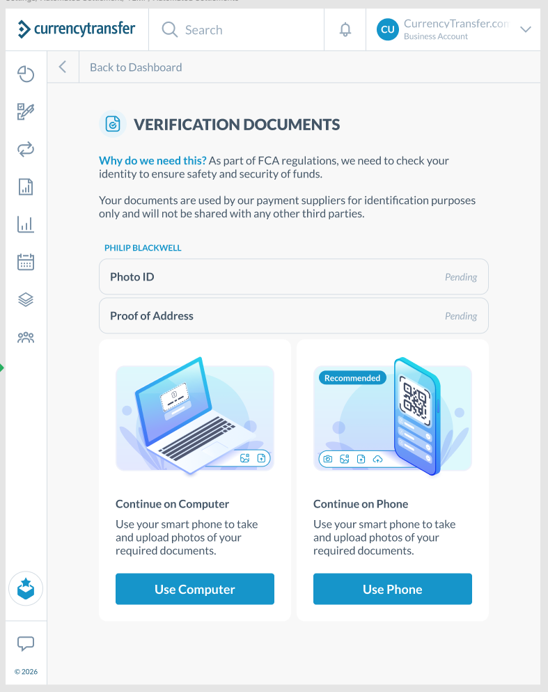
What's wrong today
The list says what is missing and the cards say how to fix it, but they sit 400px apart with nothing connecting them. A user reads "Pending", looks for something to click on that row, finds nothing, and has to scroll and decide on a channel before they've done anything.
Specific issues
- Pending rows are not clickable. The status reads like a label, not a task.
- Two big cards with equal weight force a decision before any action. "Recommended" on Phone fights with Computer being listed first.
- Both cards carry the same copy. The Computer card says "use your smart phone".
- The cards don't scale. A business account with three directors has six pending rows and still one pair of cards at the bottom.
- Illustrations take the space that document requirements (what counts as Photo ID) should have.
Principle behind every variant
Put the verb on the noun. The row that says Pending should be the thing you click. The phone route is a session-level handoff, so it belongs once on the page, not once per row, and it should never block the desktop path.
A · Buttons only
Drop the illustrations and the card boxes. Keep the two routes as plain buttons directly under the list, with Computer as the primary since that's where the user already is.
Pros
- Smallest change. Probably a CSS and copy ticket, no new components.
- Buttons now sit next to the list, so no scrolling and no illustration noise.
- Fixes the duplicate copy and the Recommended contradiction.
Cons
- Still choose-then-act. Clicking Upload has to ask "which document?" as a second step (try it), which is exactly the step the list already answered.
- Rows are still dead. Users will keep clicking "Pending" and getting nothing.
- Doesn't scale for multiple people any better than today.
Your rating
B · Inline upload
Each pending row gets a small Upload button that opens the file picker directly. The phone route becomes one compact strip under the list: a sentence, a QR code, and a "send link" button. No cards, no decision before action.
Pros
- Zero-thought path: see Pending, click Upload, pick file, done. The row updates in place.
- Scales linearly. Six rows means six buttons, one strip.
- Phone remains visible without competing. It's a secondary offer, not a fork in the road.
- Cheap: a button per row plus a strip. The strip can reuse whatever the phone flow already sends.
Cons
- No room for document guidance (which IDs are accepted, both sides, not expired). That gets pushed to the file picker moment or a tooltip.
- If the phone route really is preferred for quality, the small strip may under-sell it.
Your rating
C · Expand in place
Clicking a pending row (or its Upload button) expands it into a panel: accepted document types on the left, common rejections on the right, a drop zone below, and a quiet "do this one on your phone instead" link. The row collapses back with its new status.
Pros
- Guidance lands exactly when it's needed, per document. Fewer rejected uploads, fewer support tickets.
- Drag-and-drop on desktop, which the current design ignores entirely.
- Everything happens inside the list. The user never leaves the context that told them what was missing.
- Phone offer is right there in the panel, so nobody misses it, but it doesn't block anything.
Cons
- Most build effort: an accordion row component, a drop zone, per-document requirement copy.
- Requirement copy needs writing and keeping in sync with what the compliance partner actually accepts.
- On very small viewports the two-column requirements need to stack.
Your rating
D · Phone rail
Same per-row Upload as B, but the phone handoff becomes a persistent card to the right of the list with a large QR. The user sees both routes at once, above the fold, without either blocking the other.
Pros
- If phone is truly recommended, this is the only variant that gives it real prominence without forcing a choice.
- QR is scannable at a glance. No "send me a link" round-trip.
- Rows still work on their own for people who have the PDF on their desktop.
Cons
- Needs width. Below about 900px the rail has to drop under the list, which turns it into B's strip anyway.
- Two focal points on the page. Some users will scan the QR, some will click Upload, and you'll need to reconcile state when a document arrives from the phone mid-session (the mock shows this).
- Content area is currently capped narrow; this variant means widening it.
Your rating
Pick a direction
Ratings and notes are saved in this browser. Copy the JSON and paste it back into the session.